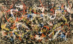
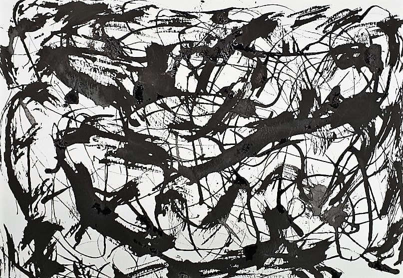
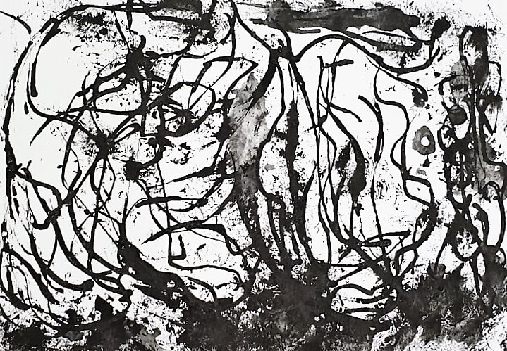
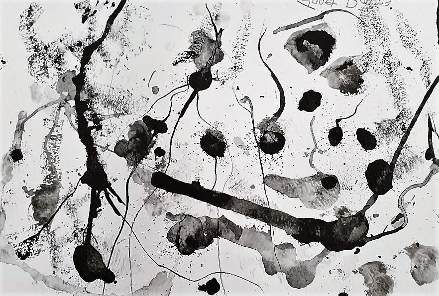
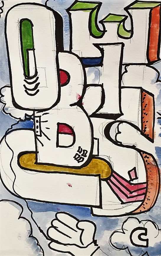
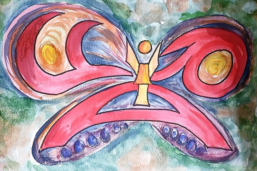
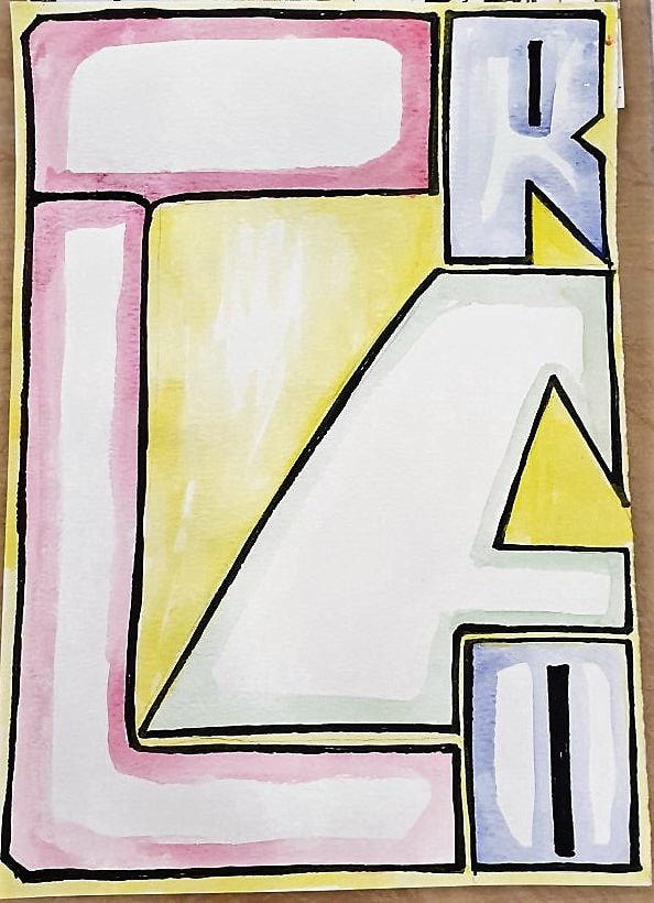
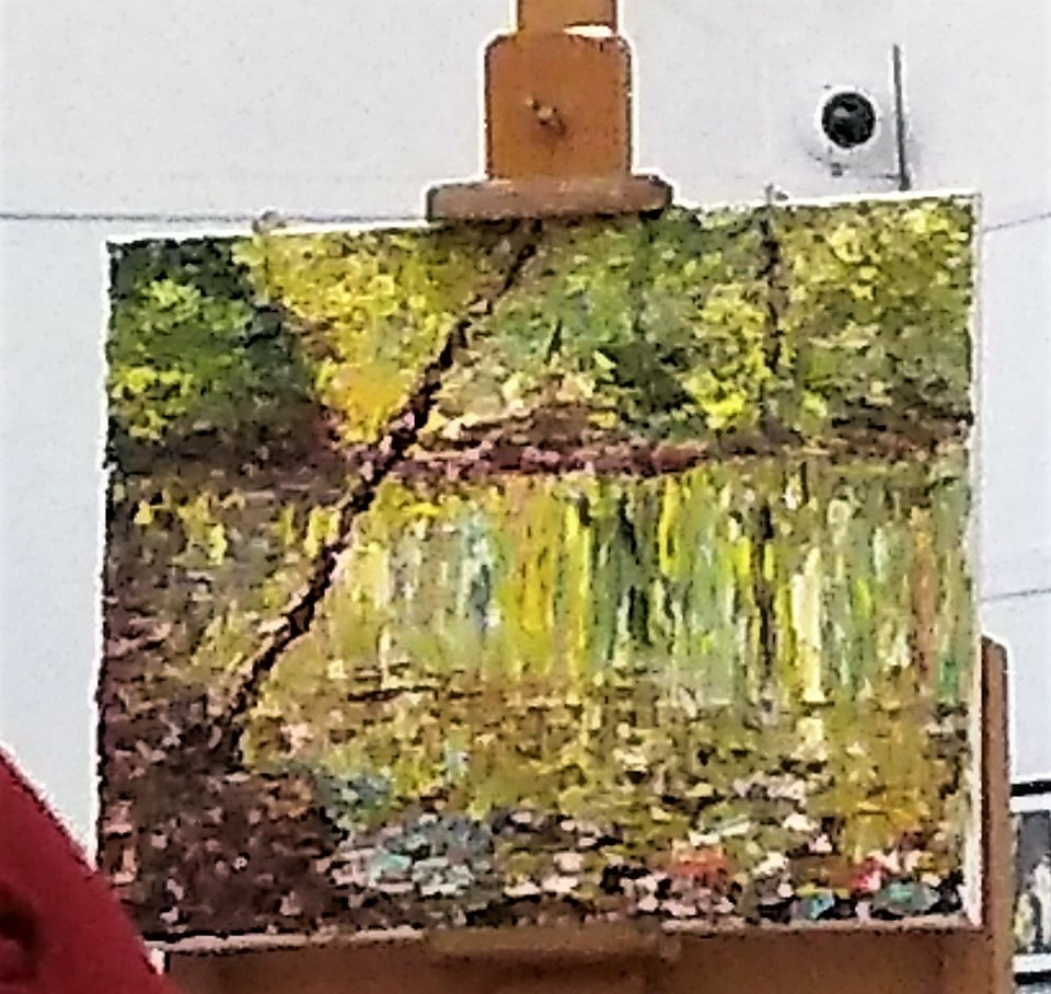
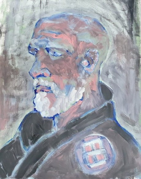
 After an interesting workshop last week looking at paintings by Mondrian and Kandinsky and then experimenting in the session, members were looking forward to this week's workshop. The theme was Abstract Expressionism. Danny started by introducing the subject and then moved on to looking at how Jackson Pollock progressed from his early studies and paintings using early native American symbols, to his more well known action paintings. Our first task involved the use of a pipette and black ink. We experimented with mark making using squeezing the pipette to get different thickness of lines and creating bubbles that popped to give splatter effects. Considering that we all had the same starting point, it was interesting to see the range of results. It was enjoyable to have the freedom to experiment and it was easy to see how these could be developed further. 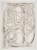 After the break, we looked at the work of Jasper Johns and particularly his paintings using the numbers 0-9. It was interesting to see how these could be combined and give a different painting. We were asked to pick a word of four or five letters and design a composition built up from these letters. The distracting spaces could be filled up with shapes if we wished. Again, it was interesting to see the range of work produced and often difficult to guess the word used as they were so well done. Another superb session by Danny and it certainly made us think about creating more abstract work. There was even enough material for at least another two sessions! Hopefully, we will be able to expand on this, with him, on a future date.
0 Comments
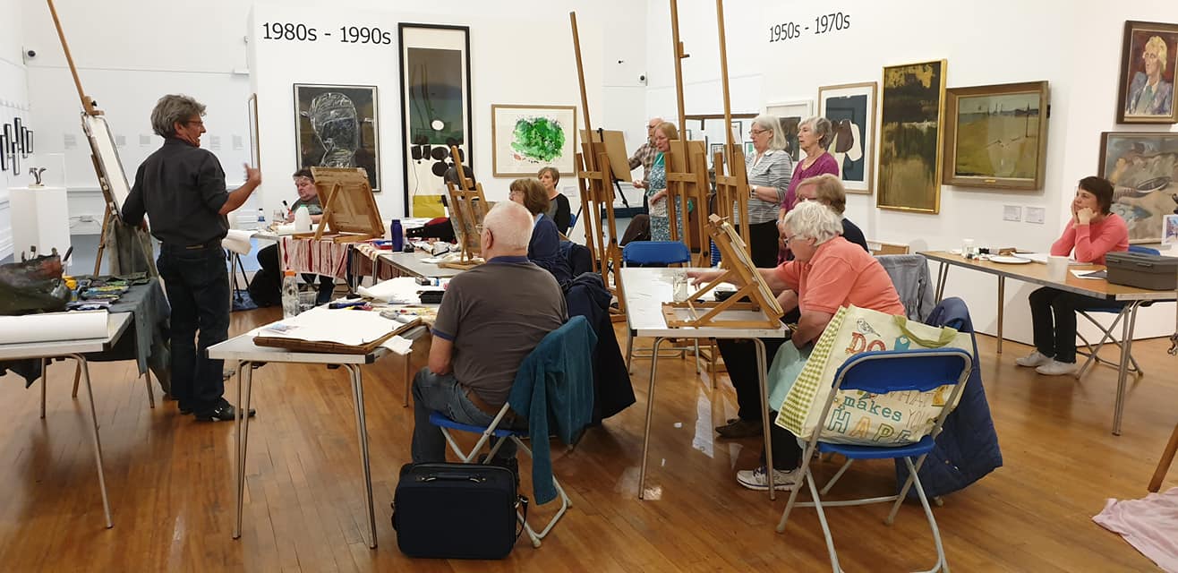
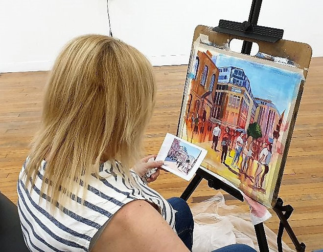
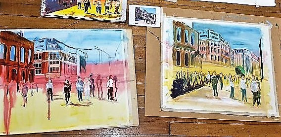
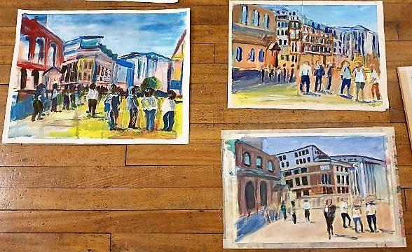
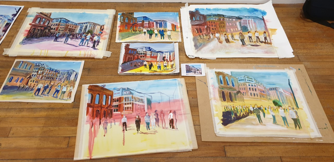
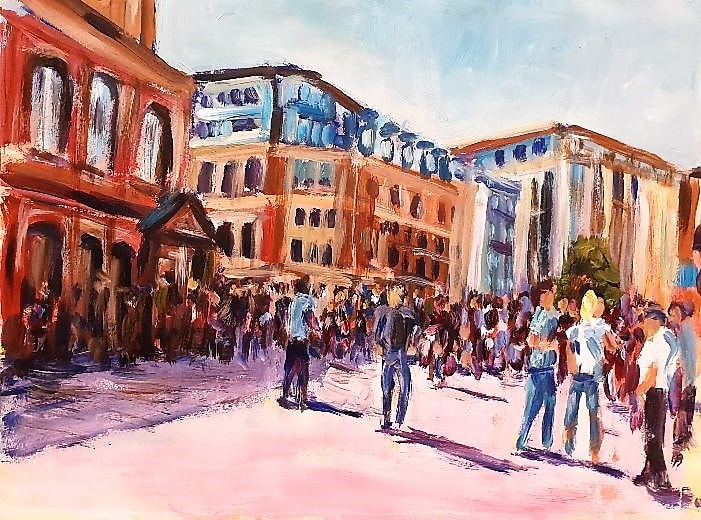
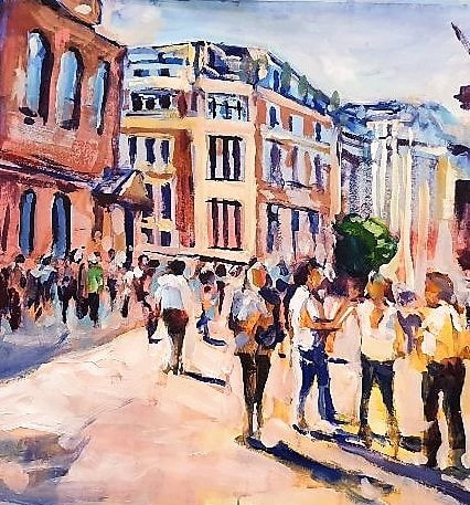
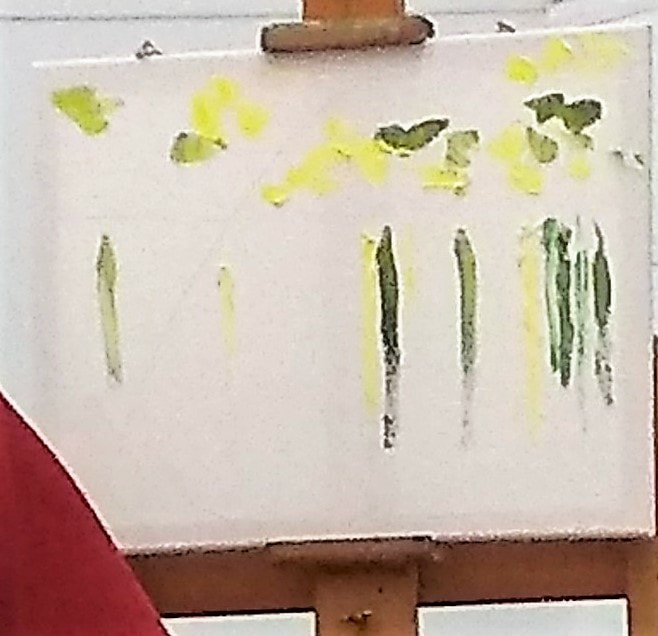
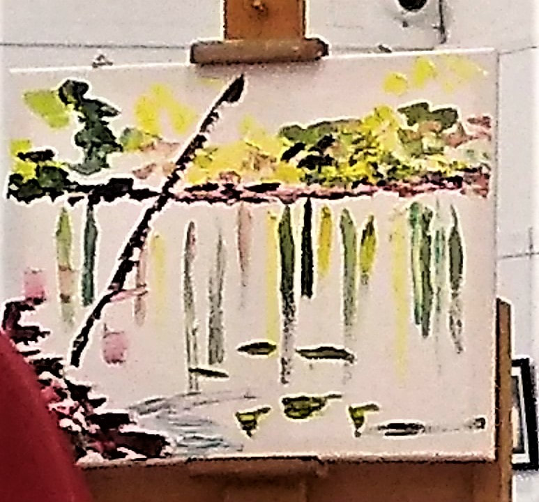
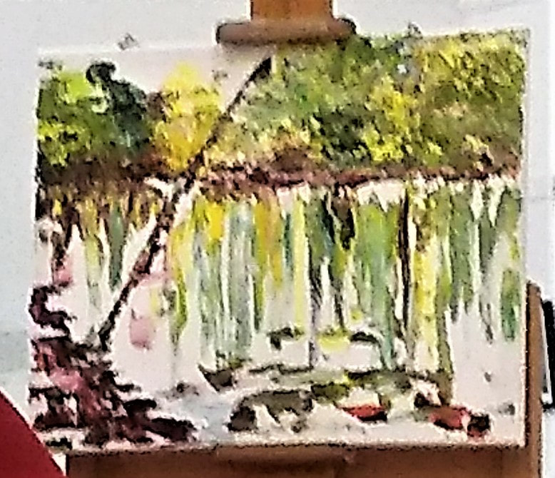
After an informative demonstration last week, it was our turn to have a go at the technique Anthony illustrated. He completed his painting in about one and a half hours whereas, we probably needed twice as long. Having said that, there were some impressive paintings by members. It will be interesting to see if anyone carries on in this style and we may even have some examples in our exhibition, at the end of September. To introduce the topic, Anthony showed us a series of his paintings demonstrating a range of techniques, before revealing the Manchester scene that he was going to do. He uses a limited palette of Burnt Sienna, Processed Yellow, Cerulean Blue, Ultramarine, Phthalo Green, Alizarin Crimson and Titanium White. Starting by finding the horizon line, he then applies a quick wash of colours allowing them to drip and run. Next, he starts to draw the subject using a paint brush with a dark colour. In the foreground he blocks in rough shapes, of the figures that he wants to include in the painting. This helps him to create depth. He then adds the buildings to balance his composition, before painting in the sky. After this, he starts painting the buildings, adding shadows and some warmer tones. Here details are starting to be added. The figures are then painted with thicker paint and as the painting progresses, opaque paint is added to the road and buildings. Here he is looking for negative spaces to bring the composition together and make the figures stand out. He continues to add details, where required, constantly standing back to see where adjustments are needed. His marks are still applied quickly, as he works all over the picture. He looks for highlights and starts to add faces etc to the people in the foreground. Finally, white is used in areas to finish the work. He explains that he has started with mid tones and then added the lights and darks in this painting. Like all good demonstrators, he explained his work as he went along and produced a skilled final composition. Next week, we will all be following along on our own work, hopefully it will be as easy as he made it look; although I doubt this will be the case. Never volunteer for anything is the saying! At a recent Committee meeting, members asked if anyone could run a session and I agreed to do either a workshop or demonstration. I have done several workshops but never just a demonstration. I thought nothing more of it until my name appeared on the programme in September for April, but April then seemed a long way off. The session was soon approaching so I decided to offer a workshop for those interested with other members being able to just watch the demonstration. I picked a painting I had done before and decided to scale it down because my usual paintings take about five hours and I only had about ninety minutes. The week before, I gave out the list of materials I would be using in case anyone wanted to paint along: Oil Paints: White (large tube), Cadmium Yellow Pale Hue, Lemon Yellow Hue, Cadmium Orange Hue, Burnt Sienna, Cerulean Blue, French Ultramarine, Cobalt Blue, French Ultramarine, Cobalt Violet Hue, Alizarin Crimson, Burnt Umber. Wooden Palette or similar on which to mix paint, Palette knife, Canvas or Canvas board, Toilet paper, Pencil. Wednesday 3rd April Salford Art Club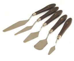 Arriving early, I stated to set up ably helped by my wife Sue and committee members, Robert and David. Panic soon settled in, with me hoping that I had remembered everything. A fleeting anxiety moment flared as I wondered if anyone would turn up! Eventually, the room slowly filled up, a few people have brought paints etc but most decide just to watch. Although I have brought a range of palette knives, I really only use the one shown at the bottom of this group. I started by loosely adding the lighter tones mixing White with Lemon Yellow and Cadmium Yellow. Next , I mixed a green using Cerulean Blue and French Ultramarine and added them to the yellows, I had already made; this made my greens. Afterwards, I mixed a darker colour, using Burnt Umber and French Ultramarine, to give myself a foreground tree and a shoreline at the back. The foliage at the back is added using the end of the knife whereas for the reflections in the water, the paint is dragged down the canvas. The colours are applied in all areas to unify the composition. After getting the basic structure in, I started to add the other colours. A little Red on the shoreline to give a contrast to the greens and a little Blue to contrast with the Autumn Oranges I am using. Once the canvas starts to be covered, I worked on the top third adding texture, with the tip of the knife, and then lights and darks to give a contrast. Next, I worked on covering all the water, dragging more colours in to depict the reflections, also starting to add definition to the tree and foreground. Time for a tea break and to my surprise, I had completed more of the painting than I had expected. 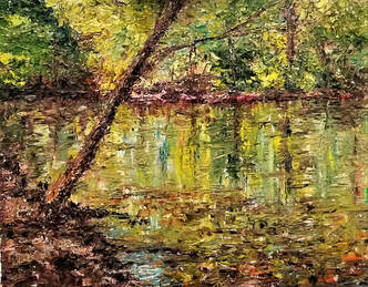 After the break, the whole canvas was covered so I then had to make the reflections in the water more realistic. To do this I used the tip of the knife to scratch across the colours to give the effect of ripples in the water. Stepping back to see if anything stood out, I was then able just to add a few final touches before finishing with time to spare. This allowed me to have a questions and answer session. This also allowed me time to inform members about my upcoming exhibition in May at the Parsonage Didsbury and to invite them to the preview on Sunday 5th May 1-3pm. It was even suggested the club uses this date as an outdoor sketching event for members. For my first demonstration, I was pleased with how it went, even though my timing was slightly out. All you can hope for is that members have enjoyed the experience and have been able to take something away from it. Possibly inspiring others to have a go at this technique.
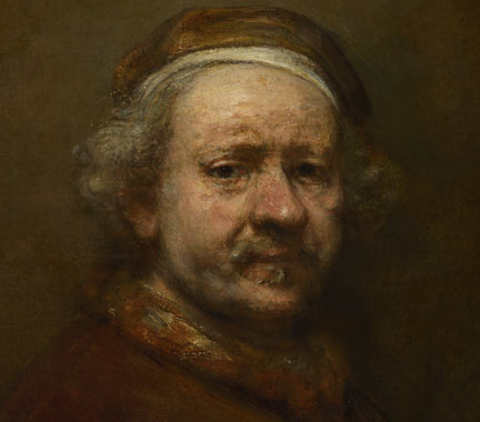
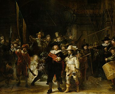
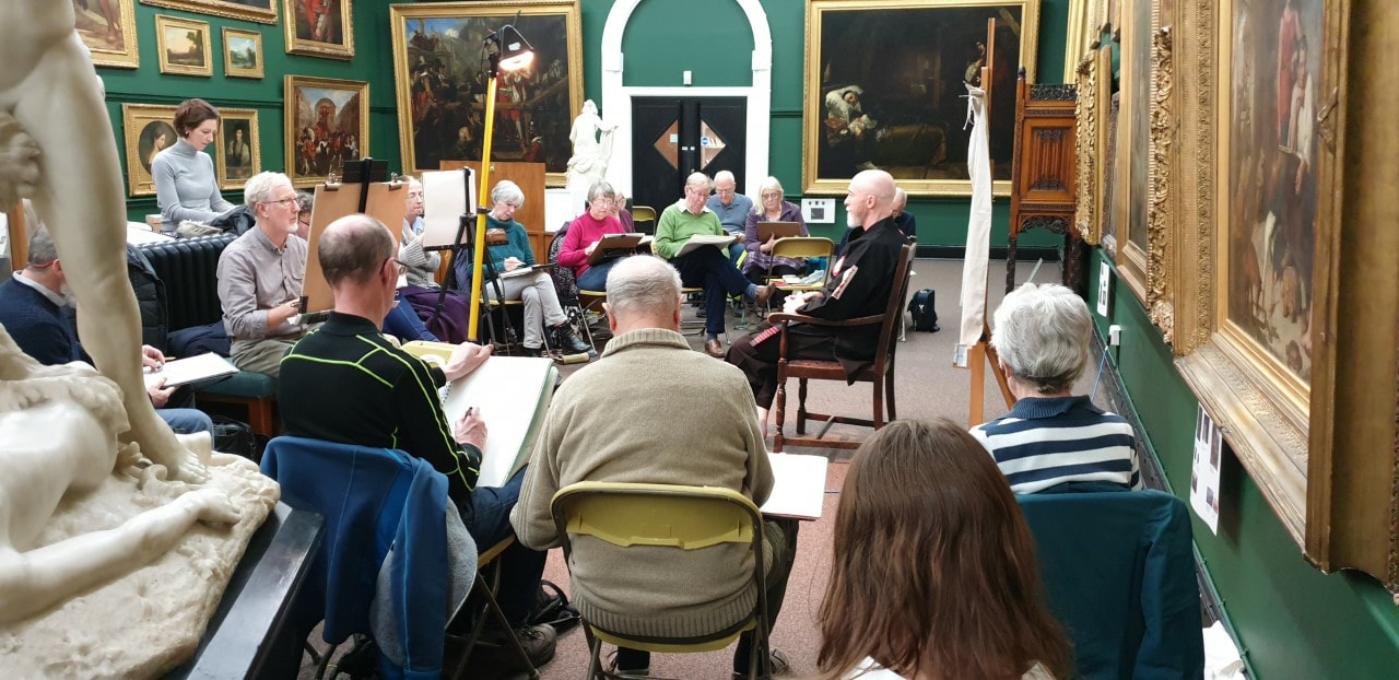
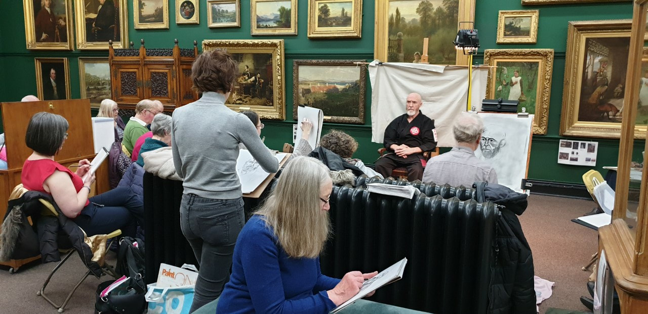
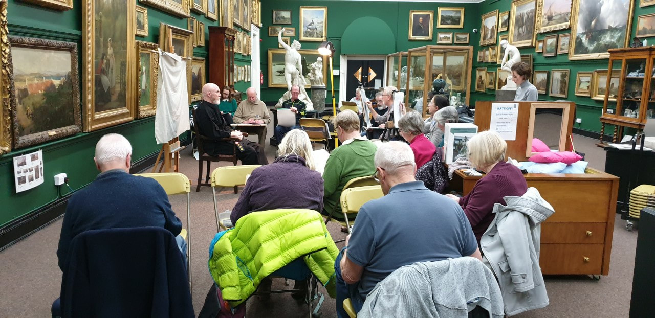
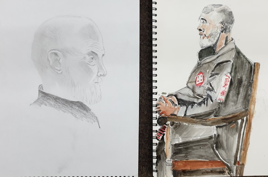
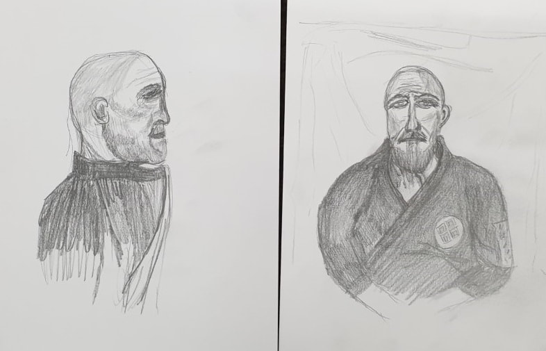
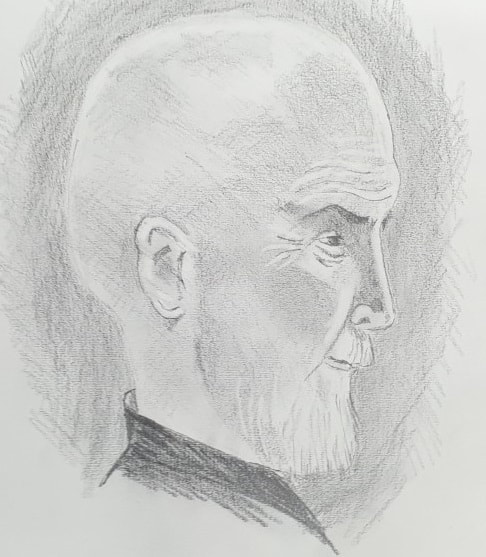
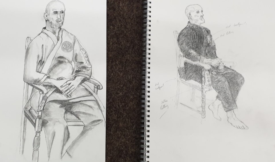
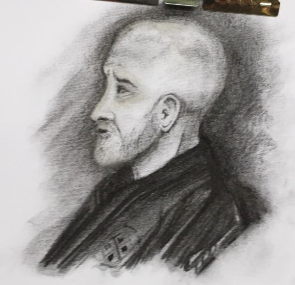
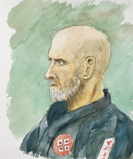
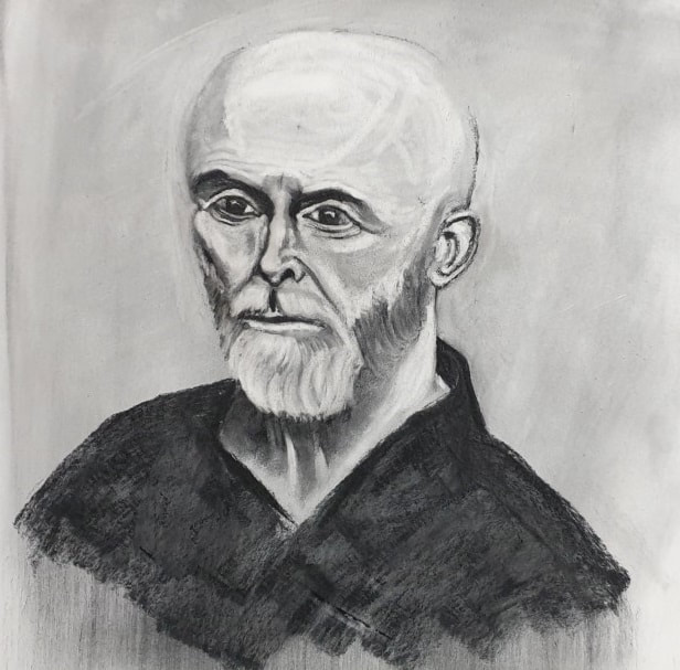
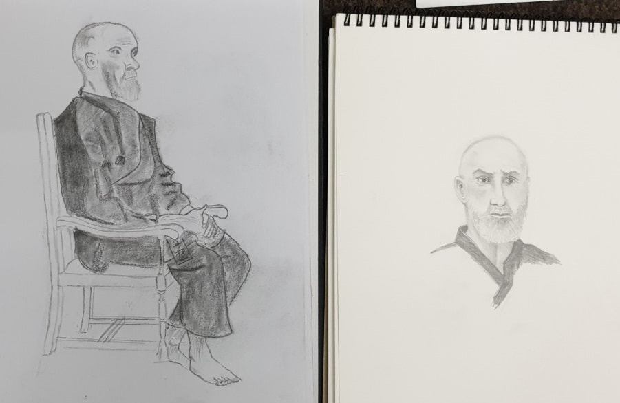
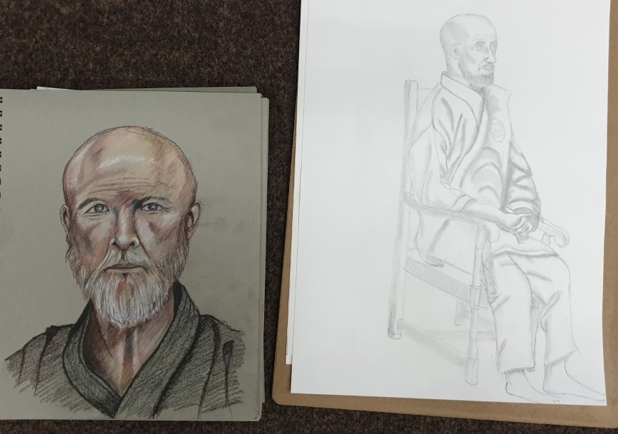
It was therefore pleasing to see this comment from Gill one of the members. "Thank you so much for the inspiration Philip. I got home, dug out my oils and palette knife and used an oil and acrylic paper pad I had in a cupboard. I then completed my first ever palette knife oil. I thought I'd give it a go." And George also commented. "It makes you want to go home and have a go!' Some brief notes that some up the talk by David. The session was highly enjoyable, informative and enjoyed by the members. Rembrandt. 1606-1669 * Born in an age of political rebellion in Europe and Religious change. The Netherlands gained independence from Spain and divided into a Protestant nation in the North and a Catholic country in Flanders * Artists faced a crisis in the North as the puritan style religion did not want so much decoration in its churches. Artists had to develop new genres such as seascapes, still life pictures, domestic scenes and more and more portraits. * Rembrandt's full name was Rembrandt Harmeszoom (son of Harmes) Leidon(from the town of) or Rembrandt Harmeszoon Van Rijn (by the river Rhine) His father owned a windmill. * In his first studio his work was admired by the secretary to the Prince of Orange. He made a name for himself painting portraits that were sent all over Europe. * His next studio was in Amsterdam. * Married Saskiatha daughter of a burghermaster, in 1634. A big step up in status. First 3 children died before reaching the age of 2. *Painted for the whole Amsterdam community: -Jews, Baptists, Mennonites Calvinists and Catholics. He could then paint religious subjects like Carravagio and paint portraits like Titian. * Highly successful and bought a large studio. Lived extravagantly, painting group photographs of Civic groups including the famous Night Watch. * 1642 Saskia died 9 months after son Titus was born. In her will half her money was left to Titus. She also stipulated that Rembrandt should not remarry. Because he missed home life so much he was able to put a good deal more humanity into portraits than anyone else had managed to do. * Lived with a housekeeper and this shocking behaviour caused Calvinist custom to drift away. * Unpaid debts forced him out of his studio and into bankruptcy. Lived with Hendrichije Stoffels and Titus. * In later life he lost his son and Hendrichije Stoffels so that his later life was lived out in penury, painting self portraits. Background on the Local Champion Name : Stephen David Charles Surtees. Born : Salford Rank : 8th Dan Hanchi. Professor of Martial Sciences. Style : Shoto Ryu under Sensei Yoshio Kimura Soke, direct lineage toGichin Funakoshi. Other style : Shito Ryu, (Shukokai). Other arts studied : BJJ under Tony Delany 8th Dan Hanshi, under Rick> Young & The Machado Brothers. Filipino Arts under Tony Delany & Dan Inosanto. Accomplishments : Kumite, Double WUKF World Champion. WUKF European Champion, 15 times KYK National Champion, British SKU Open Champion. England International, Ex GB International. A good turn out from members and fascinating evening sketching Stephen, which produced some excellent results. Stephen even asked to take a few home with him. It is always nice to welcome back Paul for a demonstration. These are always informative and given in a very professional way. Paul is always looking out for images to paint. He looks for patterns that come together and how the lights and darks relate; only ever doing one off paintings. He draws his picture out lightly, using a 6b pencil and then uses a piece of equipment( see picture below) to check his measurements. He starts with the lightest values, using Ceruleum Blue and Naples Yellow for the sky, needing to get the strength of the colour right as it dries lighter. He then works on the background using Yellow Ochre and Burnt Sienna , adding a little Sap Green for the grass areas. Then, slowly working his way down the paper, he adds all the lights, generating a variety of colours, before adding Cobalt Blue for the shadows. He then dries this with a hair dryer. Paul works on one big shape at a time, starting with the distant hills by spraying the area and using Yellow Ochre, Burnt Sienna and a little Violet. Next, the buildings are added, using Cobalt Blue and Burnt Sienna. With the front of the building, he uses slightly drier paint so it doesn't fuse with the wet colours. Now, he is ready to start to work his way down the picture building up colour, shape and volume adjusting the colours as he proceeds. Next he works on the dark wall using Windsor Blue, Violet and a little Burnt Sienna; always drawing with the brush which allows him more freedom, before breaking up some of the darks with a splash of water. After finishing blocking- in, he starts to add details, with his preferred Squirrel Mop brush,. The wall on the right is completed and the lower shadow added. Thick paint is added into wet paint to get dark, soft shapes. Paul is now at the refinement and alteration stage. First, he adds detail to the wall, sketching with the brush, keeping the strokes loose, so as not to lose the flow of the painting. All these marks are dark, as he will add tones when these dry. This time adding dark colours before lights. Now, he's at the stage where details can be added, such as the windows on the farmhouse, which are painted using a little White Gouache and Ceruleum Blue. Posts and poles are added using the white with a little Yellow Ochre. As well as splashing the wall with water, he later splashes it with a little of the White and Ceruleum Blue to add extra texture. Finally, he stands back to look at the painting before adding a few final touches. The next day he will look at it, with fresh eyes. and decide on any slight adjustments , if they are needed. Unfortunately, because of the lighting in the screen the colours are a little washed out in this slideshow, but in the final picture shown below, you can see the superb use of colours clearly. 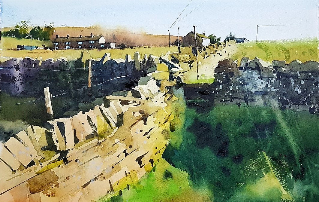 Another impressive evening with lots of useful tips and an excellent picture, which was completed in about an hour and a half. We look forward to his next demonstration, as they are always an enjoyable and interesting experience.
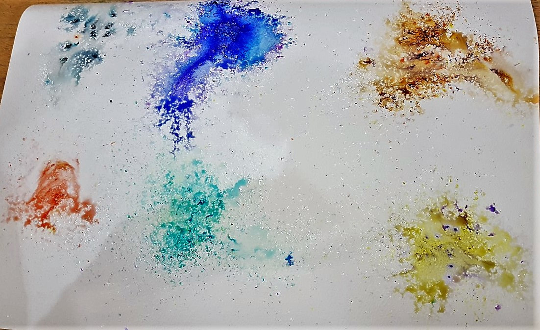
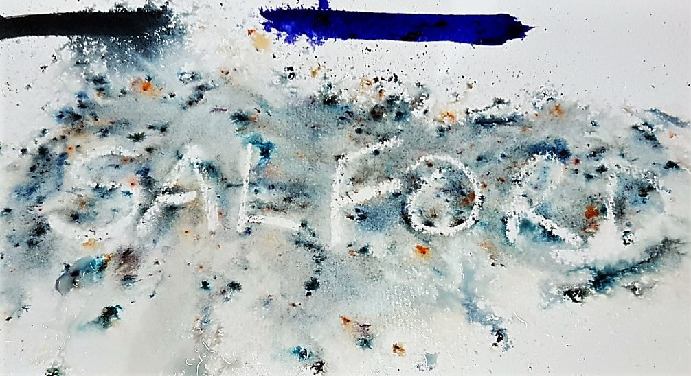
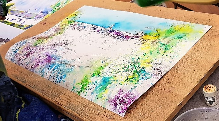
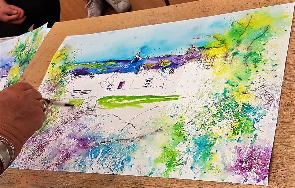
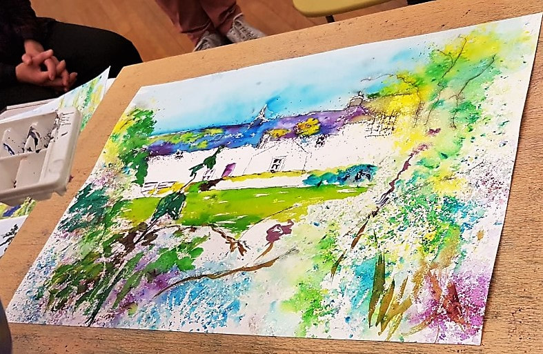
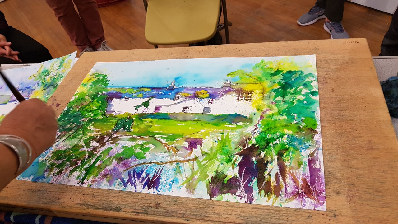
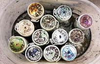 Judith started by explaining a little of the history of 'Brusho,' which was originally used as a fabric dye before artists starting using it for paintings. Brusho allows you to create visually stunning, expressive artwork with the minimum of fuss. It's fun to use, beginner-friendly and ideal if you want to learn how to create very contemporary, very striking images to hang on your wall or even sell. Because it's so loose and expressive, it can be faster to learn than traditional watercolour painting. It comes in small tubs and can last a long time. Some artists dip the brush in but Judith has made a small hole in the top of the tub and sprinkles the amount she requires on the paper. It can be used in many ways; spray and sprinkle, sprinkle and spray or like a watercolour. Judith started by sprinkling the powder on the paper and then spraying water on top. The first colour appeared to be blue but slowly changed into black, which was unusual. She then sprayed water onto the paper and sprinkled the colour into it, to show us the different effects that can be made. Wax can also be used, as a resist, to keep areas white and a diluted bleach solution can be used to lighten areas. Low tack masking tape can be used to mask off areas. After showing us how the paint could be applied, she drew out a composition in pencil on a heavyweight Bockingford rough paper, before going over some lines with a marker so as to not loose them when the paint was applied. Next, a few marks were made in the foliage with wax before starting on the sky. In a painting such as this with a busy foreground she likes a simple sky and applied this as a watercolour wash with a brush. This was left to dry over the break. Turquoise, Leaf Green, Purple and Yellow are sprinkled over the paper and then sprayed. Using the same colours the roof is applied and the windows are painted with the purple. As each area dries, she starts to add darks with a brush. This is similar to using watercolour paints; keeping the brushwork loose and adding shadows where needed. She wants the outside foliage to be like a window to the building. As more sections dry, she starts to add detail and highlights. Then she looks closer and decides the roof is too dark and demonstrates how to use the bleach solution to lighten it. Shadows are then added to the building where needed. Wanting lots of texture she continues to work on the foreground until she runs out of time. A fascinating introduction into this medium, by Judith, who always gives us lots of interesting facts and tips to improve our paintings. 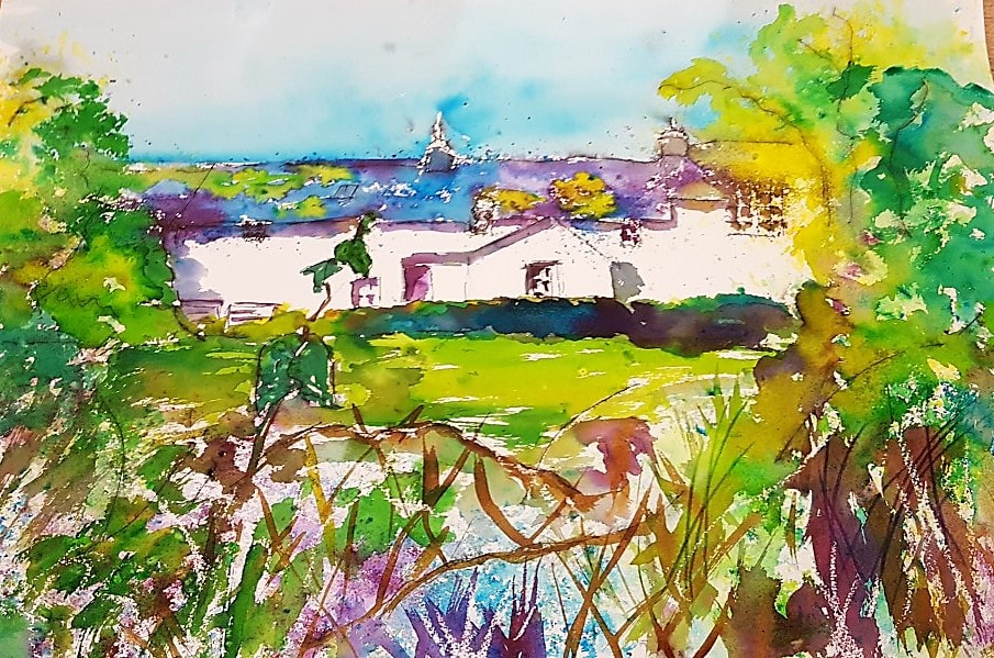 Information below
|
Categories |
||||


 RSS Feed